There are some people who spend more time explaining their art than doing their art.
... What a load of BS.
But you know what I mean, right? I'm talking about the people who come to class with torn, cliche, copy+paste, and/or obviously unfinished artwork and then spend ages talking about why they made that choice for artistic reasons.
I don't care what you say you were trying to "allude to" or what political issue the color green symbolizes, if your stuff looks like a half-assed piece of crap, I don't want to hear you talk about it for an hour.
Sorry, I'm in a little bit of a bad mood. College prereq art classes can do that to you. But you know what I mean?
First, I am currently working on a commission. One of my professors asked me to draw her granddaughters in anime style, and promised to pay me in smoked salmon (smoked herself) and albacore tuna (caught herself). I say, TOTALLY WORTH IT.
Secondly, I am thinking of selling custom stickers next quarter. By custom stickers, I mean stickers that I've drawn on my own, and stickers with designs that people commission me to draw for them. I'm hoping to get some small spending money from this. What do you think?
I also want to do the same thing with buttons, but I'll have to find a good, affordable button maker first.
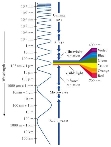
The portion on the electromagnetic spectrum that we can detect with our eyes is called "visible light" or just "light." The electromagnetic spectrum is composed of electromagnetic radiation that takes the form of wavelengths. The normal human eye can see a wavelength range of around 400-700 nanometers (nm), which encompasses the colors violet to red. These colors are actually wavelengths of different size, from violet being the shortest to red the longest. The wavelengths that humans can detect also have frequencies between 790-400 terahertz.
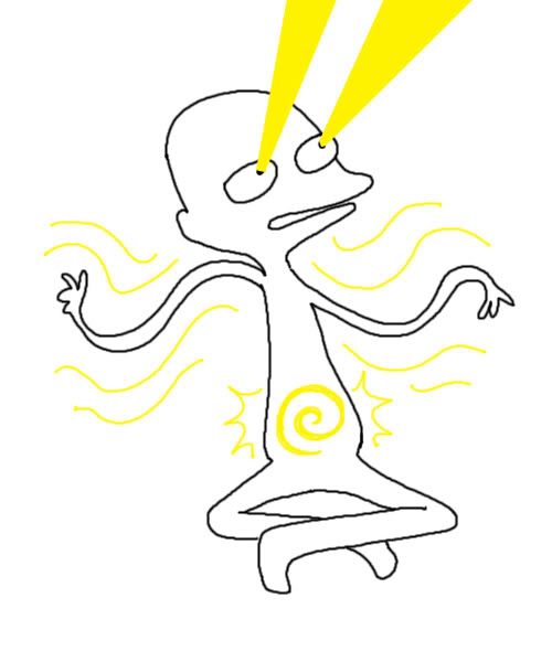
In the visible spectrum, the color yellow has a wavelength of 570-590 nm and a frequency of 508-526 THz. This places it in the middle between violet and red, and nearly in the center of the visible spectrum. Here’s what it would look like if you were comparing the speeds.
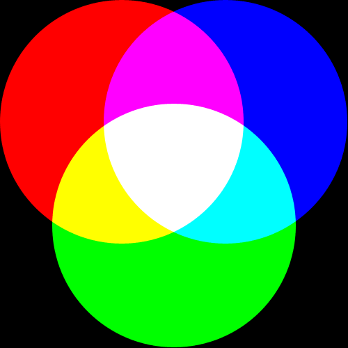
There are some colors that cannot be seen on the visible spectrum, such as the color magenta. These colors can only be seen when two different wavelengths hit the same spot on the retina of the eye at the same time. The color yellow does appear on that spectrum, which means that the eye can perceive the color with only a single wavelength of light. An interesting fact, however, is that when using additive color through light, yellow can also be perceived when red and green light is shining on a screen, with no true yellow wavelengths included. This is because the electrical signal sent to the brain by the combination of two wavelength of red and green is very similar to the signal sent to the brain when the eye picks up one wavelength of yellow. This is because the single wavelength for yellow is between the wavelengths for red and green on the visible spectrum, which makes both the red and green cones in your eyes fire nerve impulses. Essentially, the wavelength for yellow stimulates the same nerves the combination of wavelengths from red and green does.
In the real world, yellow wavelengths can be found in the low-pressure sodium vapor lamps used in some parking lots. They emit a yellow light with a wavelength of 589 nm.
How does the Creative Commons project alter the way we understand ownership and copyright?
How does this project affect the subject(s) of a work?
How would a Creative Commons license have altered the works in our textbook reading (Gone with the Wind, the work of Sherrie Levine and Michael Mandiberg)?
Does the Creative Commons project afford any protection to the right of publicity (the Bela Lugosi case)?
The Creative Commons projects changes the way we understand ownership and copyright by creating a place between "all rights reserved" and "no rights reserved." Instead of having to choose between giving others full use or no use of their work, artists can define some use of their work under Creative Commons. An example of this could be when an artist lets you use some of their work in your own productions, as long as you give them credit as the creator. This project affects the subject(s) of a work by creating opportunities for the expansion, alteration, and/or use of the work by others.
A Creative Commons license could have changed the issues regarding the works in our reading (Gone with the Wind, the work of Sherrie Levine and Michael Mandiberg) by making it easier to use the work and work around the copyright. Maybe there would be less controversy and opposition to Levine and Mandiberg's reproduction and display of someone else's photos if the original artist, Walker Evans, had specified guidelines for the use of his work through Creative Commons. However, I'm unsure if the Creative Commons could afford any protection to the right of publicity (as in the Bela Lugosi case). I think this is a topic that should be discussed further in class.
The picture above was one of the many featured in The Language of the Nude: Four Centuries of Drawing the Human Body exhibit at the Reed College's Cooley Gallery. This picture caught my eye with because of its loose and expressive linework, yet extravagant lighting and attention to detail. It became my favorite piece in the gallery, particularly for the extremely skillful highlighting which approaches dramatic chiaroscuro without the use of strong shadows. Overall, I thought this was a lovely and well-crafted piece.
In reflection of the exhibition as a whole, I thought it was a nice way of witnessing some of the changes in the style of the nude throughout changes in history and location. The increase in naturalism, with more realistic proportions and expressive poses, with the increase of time was a good indicator of changes in the views and processes of artists in various eras.
Another thing I realized after viewing the gallery was a significant difference between the conventions for depicting the nude human body in the past and the present. This shift was that, in the time these artworks were created, the ideal nude was most often of a naked man. I found that this was a sharp contrast to the nudes most often depicted in today's art, the naked woman. I think this represents a changing of views in the world, especially in the definition of human beauty.


